The Quiet Palette: A Guide to Layering Shades of Oatmeal Stone and Mist for a Calming Interior
A calm and restorative interior does not have to be monochrome or stark. By choosing a quiet palette built around gentle neutrals such as oatmeal, stone and mist, you can create a space that feels soothing, tactile and deeply inviting. These colours work together to build depth without drama and provide a serene backdrop for thoughtfully curated materials and textures. This guide explains how to combine these tones effectively to design interiors that feel restful and refined.
What Makes a Quiet Palette
A quiet palette is rooted in soft neutrals that sit comfortably between warm and cool tones. Shades such as oatmeal, stone, sand and mist are inspired by nature: sandy shores, weathered pebbles and gentle morning haze. These tones feel understated and calm without feeling bland because they have subtle undertones and dimensions that respond beautifully to light and texture. Designers frequently use these hues as foundations for layered interiors that feel both timeless and tranquil.
These colours are particularly suited to homes where comfort and wellbeing are priorities. Instead of creating stark contrasts, a quiet palette helps spaces feel cohesive and enveloping. When paired with natural materials such as wood, linen and stone, the visual language becomes richer and more tactile, enhancing the sense of calm.
Understanding the Key Shades
Oatmeal is a soft, warm neutral that sits between cream and beige. It evokes the warmth of sunlit fibres and sandy soils, introducing light without starkness. It is an excellent base colour for walls, upholstery and larger surfaces because it reflects light gently and pairs well with textures.
Stone refers to shades inspired by limestone, sandstone and weathered pebbles. Stone hues have both warm and cool undertones depending on natural lighting, giving them remarkable versatility. These tones provide a calm backdrop that enhances both natural materials and more refined finishes.
Mist is a soft hue with an almost ethereal quality, often sitting between warm greys and cool neutrals. It captures the softness of early morning light and works well as a secondary layer to balance warmer neutrals like oatmeal without making a space feel cold or austere.
Together, these tones create a layered but subtle scheme that avoids the flatness of single-tone spaces. The interplay of warm and cool undertones prevents the palette from feeling static and helps it adapt to different lighting conditions throughout the day.
Layering for Depth and Calm
Layering is key to a truly calming interior. Rather than using one neutral tone throughout, designers recommend combining multiple hues within the same tonal family to create interest and dimension.
Start with a base colour such as oatmeal on walls or large furniture. This sets a warm and inviting foundation. Next, introduce stone tones in secondary elements like rugs, throws or accent furniture. Stone brings a grounded quality that balances the warmth of oatmeal while remaining soft and harmonious.
Add mist or similar soft neutrals in textiles such as curtains, cushions and upholstered seating. Mist tones provide subtle contrast and allow the eye to rest without breaking the calm. These layers should feel connected rather than contrasting.
Using Texture to Enhance the Quiet Palette
Because neutral shades can sometimes risk appearing flat if left untouched, texture becomes an essential element. Layer textures such as linen and cotton fabrics, bouclé upholstery, woven rugs and timber finishes to bring tactile interest and depth. These materials respond to light and create gentle shadow and highlight without relying on bold colours.
For example, soft linen curtains in mist or oatmeal gently filter natural light, giving the room a lived-in and restful feel. A wool or bouclé rug in stone beneath a coffee table adds richness underfoot while maintaining the serene palette.
Natural timber furniture introduces warmth and organic variation, keeping the scheme from feeling too uniform. A stone or ceramic side table contributes another layer of texture and echoes the quiet earthy tones of the palette.
Choosing Materials and Finishes
The choice of materials and finishes can influence how peaceful the space feels. Matte and softly textured surfaces are preferable in a quiet palette because they absorb light rather than reflect it harshly. Glossy finishes can create sharper reflections and visual tension that disrupts calm.
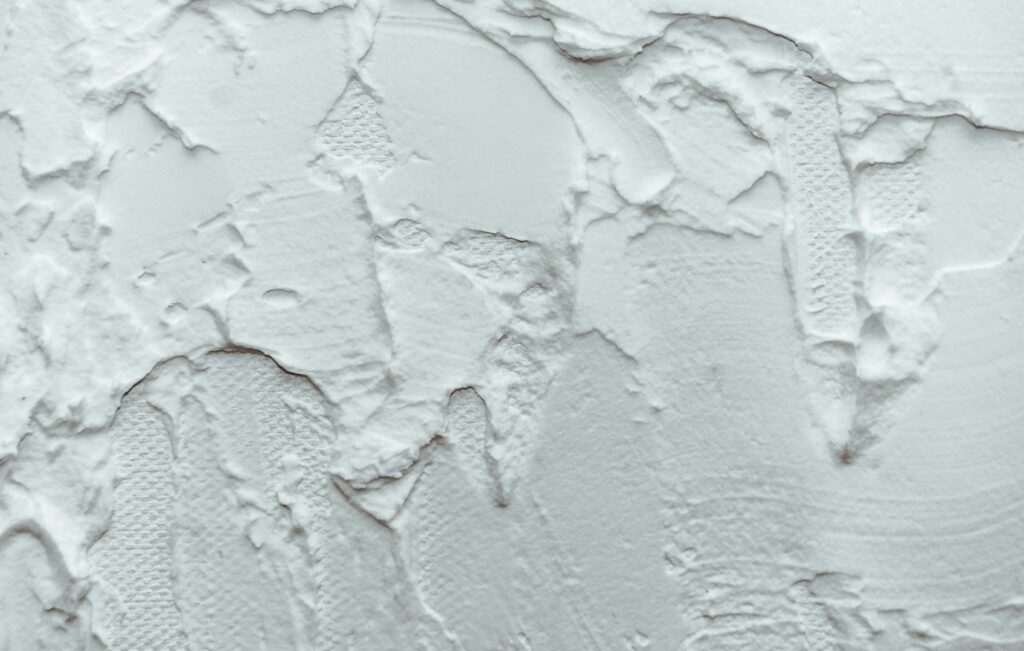
Natural plaster or limewashed walls in a soft oatmeal or stone tone feel tactile and warm. These surface treatments work beautifully in living rooms, bedrooms and hallways where the goal is to encourage tactile engagement and visual softness.
For flooring, consider warm timbers or stone tiles in gentle neutral tones. Rugs in subtle undulating patterns or natural weaves help define spaces and add another layer of sensory richness.
Planning Your Palette Room by Room
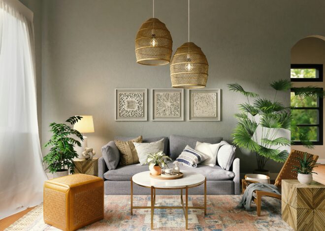
In a living room, use oatmeal walls with stone-coloured upholstery and mist-toned accents in textiles and artwork. Wooden furniture and woven baskets add warmth and texture. This layered approach ensures the room feels comforting and visually cohesive.
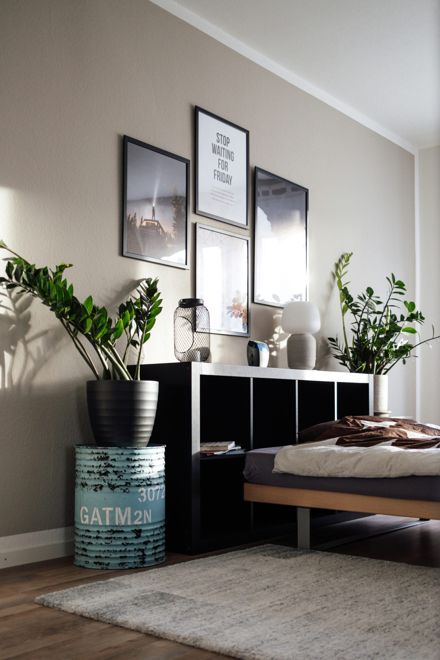
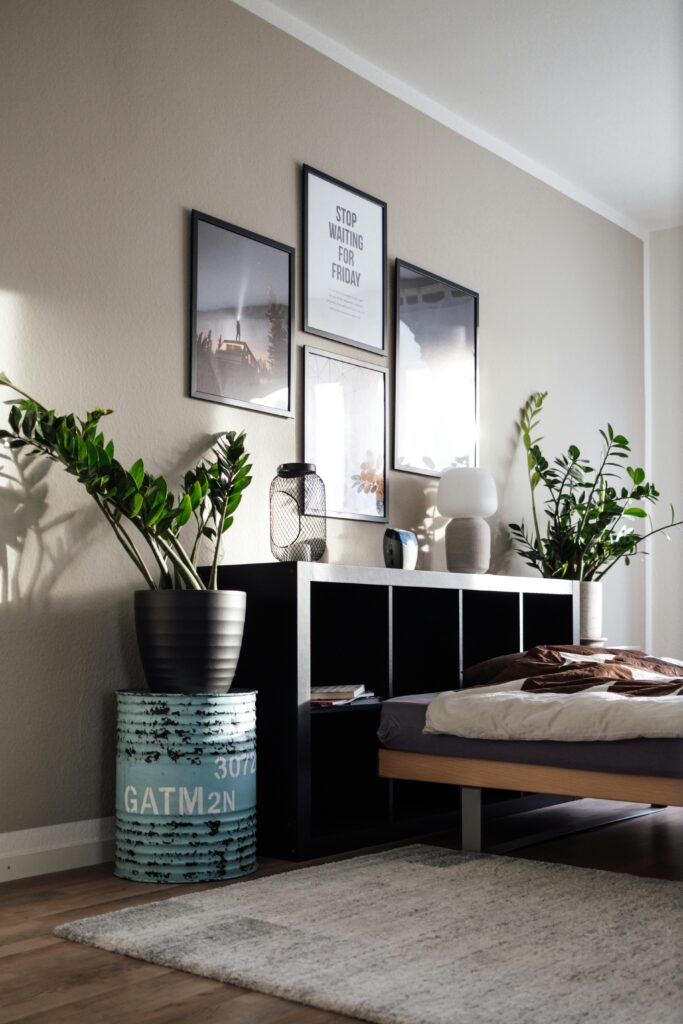
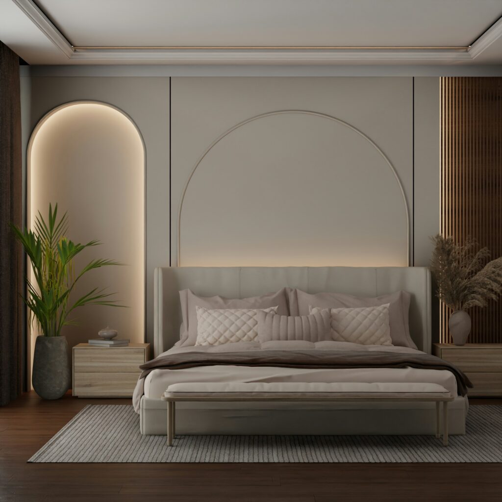
In bedrooms, keep walls and larger furnishings in light oatmeal or soft stone. Add mist-toned bedding and textured throws to create a restful retreat. Soft illumination from lamps with fabric shades reinforces the quiet palette by casting warm, diffused light.
For kitchens, choose cabinetry in stone tones paired with oatmeal-coloured tiles or countertops. Introduce mist-coloured textiles and natural materials such as oak or rattan to draw the scheme together.
Bathrooms benefit from this palette, too. Soft stone tiles paired with cream or oatmeal walls create a spa-like feel. Natural timber or bamboo accessories introduce warmth and harmony without overwhelming the sense of calm.
Avoiding Pitfalls
Even with the best palette, mistakes can happen if tones are not chosen with care. One common error is mixing warm and cool neutrals that clash rather than complement each other. It is worth testing large samples of paint and fabrics in different lighting conditions to ensure undertones align and feel cohesive throughout the day.
Another risk is making a space feel flat. This happens when colour alone is expected to provide all the interest. Instead, focus on mixing textures and materials to build depth. Natural fibres, soft textiles and varied surfaces prevent monotony while staying within the quiet palette.
Too much similarity without variation in scale or finish can make a room feel lifeless. Balance lighter tones with slightly deeper stone elements or textured textiles to create visual rhythm.
The Emotional Impact of a Quiet Palette
Colours influence how we feel in a space. Warm neutrals evoke calm, comfort and balance. A quiet palette anchored in shades like oatmeal, stone and mist encourages relaxation and well-being. It is ideal for spaces where you want to slow down, unwind and recharge.
These tones do not overwhelm the senses. Instead, they support other design elements such as form, texture and light. This creates an interior that feels considered and peaceful rather than loud or visually aggressive.
Final Thoughts
A quiet palette built on oatmeal, stone and mist offers more than aesthetic appeal. It creates a calming and tactile environment that supports everyday living. By layering these shades thoughtfully with a variety of textures and materials, you can build a space that feels cohesive, refined and deeply restful. The result is an interior that invites you to stay, breathe and feel at ease.
Related Posts
Acoustic Luxury: Using Rugs and Wall Coverings to Create a Soft Quiet and Intimate Atmosphere

Textile Tension How to Mix Rough Linens with Smooth Velvets for a Designer Look